 An important consideration when crafting a content strategy for investment managers is the problem of website usability.
Website usability for investment managers is the study of how web audiences interact with online content.
A quantitative approach, website usability analyzes behavior and provides insights that allow for website design and content creation that accounts for the observed behavior of the audience.
No doubt, we all have visited investment management websites that were, well, awful. But have you ever given much thought to what makes a website atrocious, beyond the simple knee-jerk reaction to aesthetics or content?
Next time you visit an investment management industry website, perhaps those of your primary competitors (or your own!), ask yourself whether the website falls into any of these traps:- Is the content paragraph-based, and/or largely cut-n-pasted from a print document?
- Are those paragraphs more than 5 sentences each?
- Does the content read like a white paper or research document?
- Does the content lack hyperlinks to both internal (i.e.: other pages on its own site) AND external website pages?
- Does each page lead with introductory text instead of using the inverted pyramid style?
- Does the website have a “splash page” with Flash animation or a disclaimer that requires a click-through to reach the main website?
- Does the site rely on PDF documents for content?
- Does the content contain a preponderance of jargon and industry buzzwords instead of being written plainly?
- Is there a plethora of beautifully-(or not so beautifully) crafted multiple compound sentences?
The vast majority of investment management websites at which I’ve looked are characterized by a “yes” to most, if not all, of these questions.
And as such, they fail the most basic website usability tests.
Ensuring an investment management firm’s website meets basic usability standards is extremely important for two key reasons:
- For better or worse, the website is an investment manager’s calling card. A website is the firm's most public, easily-obtained piece of marketing.
As such, it absolutely must reflect positively upon the firm’s professionalism, as well as present an acurate depiction of how a firm wants to be perceived by its target audience; and - A website that meets the basic usability standards offers clear differentiation.
As I opined earlier, most investment management websites fail to meet these basic usability thresholds. As such, the firms doing everything they can to make their websites as useful and helpful as possible are clearly demonstrating to their audience that they hold effective communications and client service as a priority.
So, how can investment management firms better optimize their websites?
There are a tremendous number of ways in which website usability can be improved, if not fully optimized, many of which I will address in future posts. As this is an introduction to the topic, I would like to outline two additional reasons why investment managers should take the time to optimize the usability of their website:
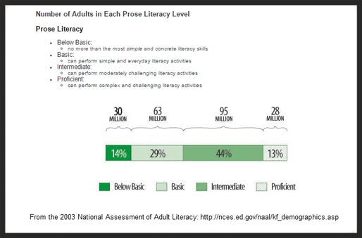
- The average American reads at an 8th grade level. Only 13% of the population is rated as "proficiently" literate.

- Studies show that in order to get an audience's attention online, the content must clearly communicate your value proposition within 10 seconds.
These facts, when used as organizing principles in website design and content strategy, allow investment managers to strip away much of what is superfluous from their core messaging.
When a site’s content and structure accounts for standard website usability protocols, comprehension increases as reading time falls. A study by website usability expert Jakob Neilsen showed that lower-literacy users saw a 135% improvement in how quickly they could complete tasks once a site’s content had been optimized.
But there is an important caveat: many visitors to investment management websites, especially those catering to institutions and high-net worth individuals, read at a level much higher than your average 13-year old.
These same studies show that the improvements for lower-literacy users did NOT come at the expense of higher-literacy users. In fact, the performance of high literacy individuals showed marked improvement as well.
The lesson? Optimizing content is not “dumbing it down,” and it is an exercise which benefits an investment manager’s entire audience.
If an investment management firm offers clients and prospects content that resonates, provided in a form and structure that works, they have demonstrated their professionalism, a devotion to client service, and established differentiation from their peers.


